Client: The Hutch Agency
Industry/Context: Independent P&C Insurance agency, has been in business for around twenty years with locations in Proctorville, OH and Lexington, KY.
Scope: Corporate identity rebrand; logo design; business card design; agency letterhead; various ongoing marketing pieces
Process: The owner recognized the insurance industry's post-COVID shift towards increased digital communication, online education as a client resource, and social media as a brand-promotion platform and free space to interact with current and potential clients in real time. Historically, the agency relied heavily on in-person meetings, word-of-mouth marketing, and paper/phone communication. The previous logo, business name, brand colors, and marketing materials had not been updated since the agency opened in the late 1990s, and they felt like they were missing out on new sales and advertising opportunities due to the lack of consistent branding across social media and other client-facing resources.
Ultimately, we decided that a complete corporate identity rebrand was needed prior to generating any physical collateral or attempting to increase their online presence. Due to their currently inconsistent and disconnected online presence, it made little sense to simply plug new logos and related updates into the various platforms, websites, and physical collateral that already existed.
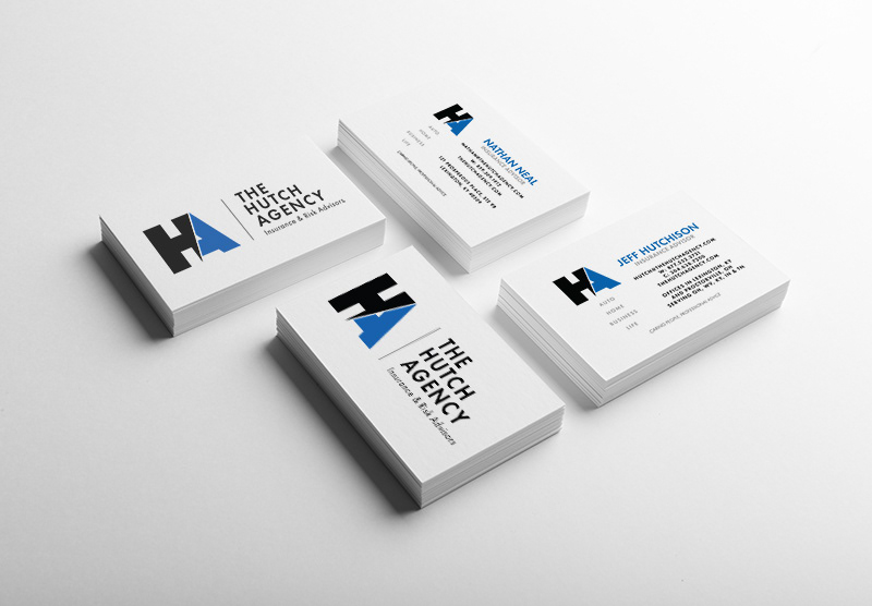
We started with the agency name - Hutchison Insurance Agency. Again, the name had served the agency well for years, but it had also limited their ability to promote themselves as not only a (primarily) Home and Auto insurance agency, but a Risk Management firm as well. Risk Management is the more refined industry term for assessing, advising, and managing a company's Commercial insurance package. In order to have a broader appeal to companies searching for a new provider, we changed the name to 'The Hutch Agency', and added 'Insurance & Risk Advisors' to the logotype. We decided to use the owner's nickname - Hutch - since most people locally knew him only by his nickname anyway. It was also a short, visually balanced word that was memorable, yet simple. As an added bonus, changing the business name allowed us to update the agency's web and email addresses as well. Hutchisoninsuranceagency.com was long and forgettable, and having to spell out "xxxxx@hutchisoninsuranceagency.com" for the email address was tedious and inefficient when having to type or write it out many times a day. Shortening the name was as much about increasing efficiency as it was about marketing.
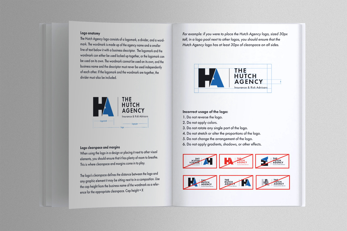
The logomark itself needed to be visually simple, and easily recognizable when on its own without the logotype. Insurance is a finance-adjacent industry, and being that, consumers tend to be drawn to visual identities that appear strong, stable, and clean. There are exceptions to the rule of course, but for the most part, bold, heavy elements arranged simply can convey a sense of security and strength.
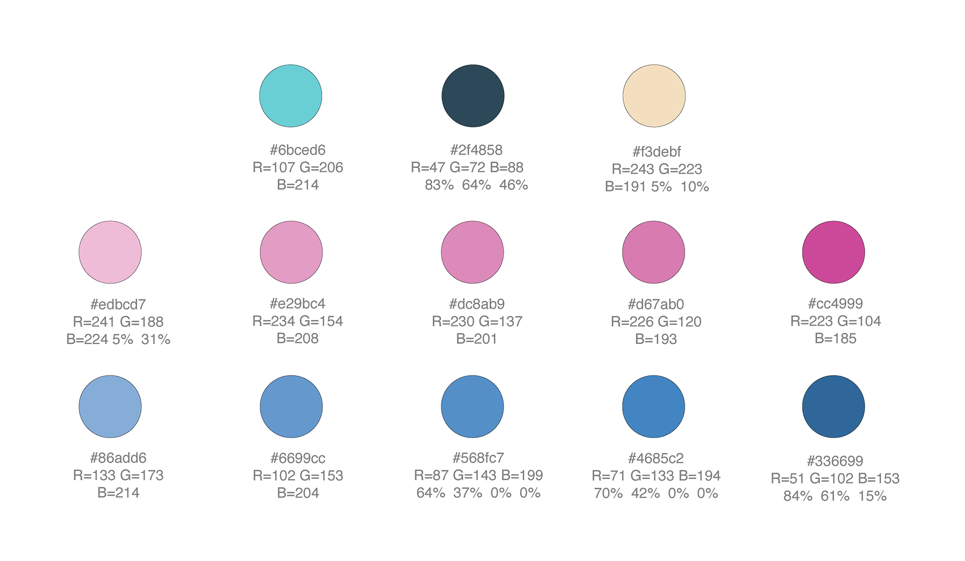
Once we'd established the logo, we worked on the brand colors. Prior to the refresh, the agency had used a darker blue in some depictions of their logo, although in my research, I didn't find any consistency in the value of blue when it was present. Considering that the agency's primary insurance carrier and owner of roughly 85% of the agency's book of business was Erie Insurance, I recommended that we match the agency's primary colors to that of Erie's in order to appear "connected" to the carrier in a more formal way. Preferably, we didn't want the agency's logo to visually compete with Erie's logo when used in the same space, and since much of the marketing collateral was Erie branded in some way, using the same brand colors was a no-brainer.
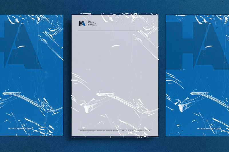
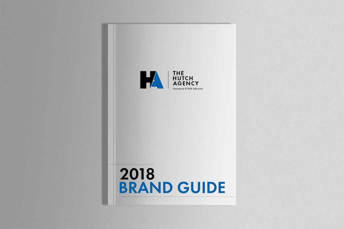
Once the logo was established, I moved on to design new business cards, agency letterhead, and a brand guide to help clarify the agency's ongoing commitment to a consistent identity. I also updated their social media pages, website, and other platforms to align with the rebrand, and designed advertisements for trade publications, partner programs, and mailers.
In addition to their brand refresh, it became apparent that there was not a defined marketing strategy in place to utilize the new materials effectively. The practices they'd used up to that point relied heavily on traditional, one-to-one communication and although it had worked to a degree, it was untenable. Remaining relevant in a marketplace where the rules of engagement had changed would require a considerable shift in thinking around client relationships, book management, scaling the agency, product positioning, sales approach, and many other factors. Luckily, the owner was on board and ready to pivot however needed to ensure the agency's longevity and growth.
We started by implementing automated processes in several places. In order to maximize efficiency during intake and increase sales opportunities, agency advisors needed to spend less time manually entering data and other minutiae, and more time advising and selling. I helped set up forms on the agency's website that were linked through Zapier, which pushed prospect/client info from a new form directly to email and the agency's CRM and AMS platforms. This eliminated the need for extraneous phone, email, and text conversations spent gathering information that was susceptible to inconsistencies and/or incomplete data, while also helping streamline and centralize client and prospect data. I also wrote scripts for several automated email, phone, and VM drip campaigns via the agency's CRM which increased referrals, Google reviews, cross-selling opportunities, and up-selling.
Even though there was a considerable shift in how things were run in the agency, the owner was excited about the changes and embraced the process.

Brand Color Guide
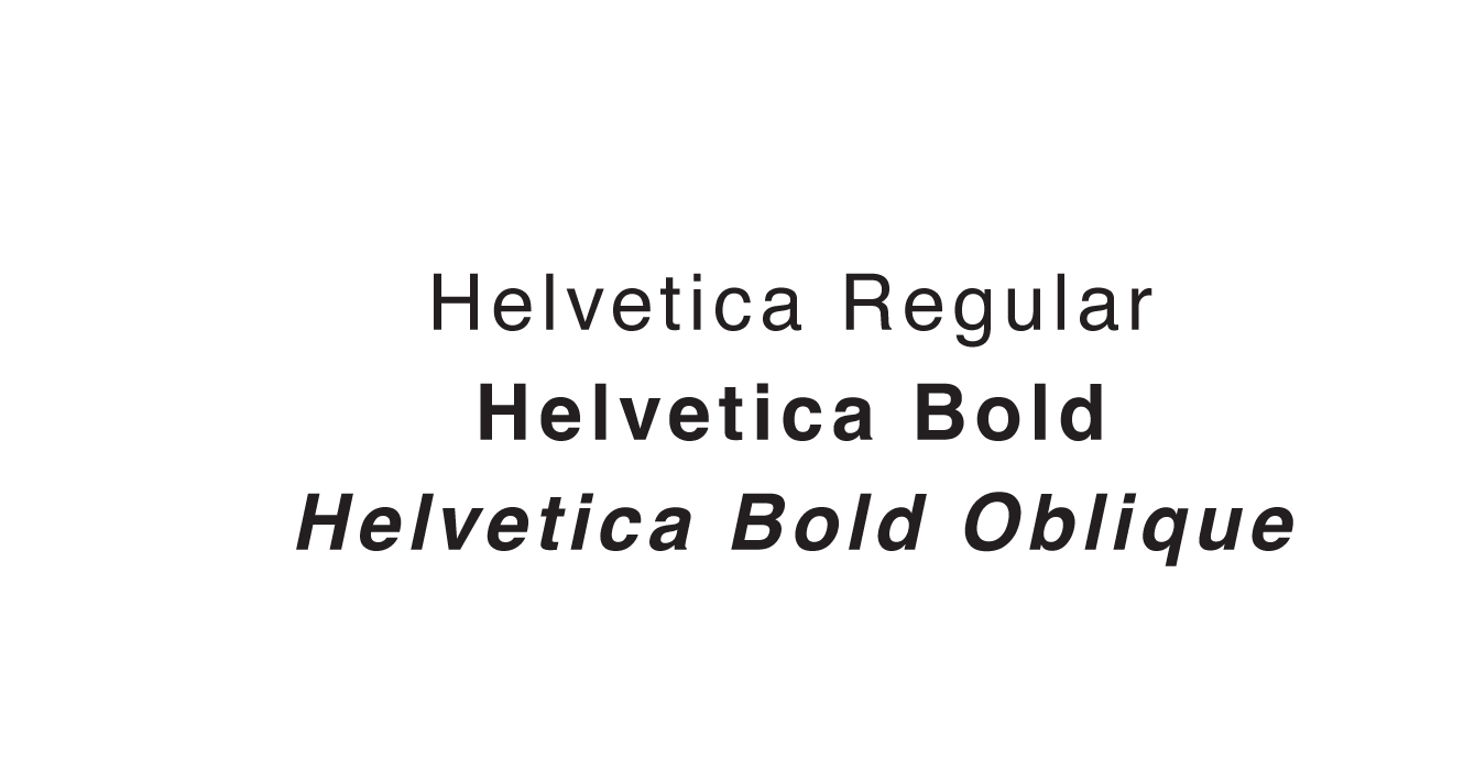
Brand Fonts

New Car Ad - 1
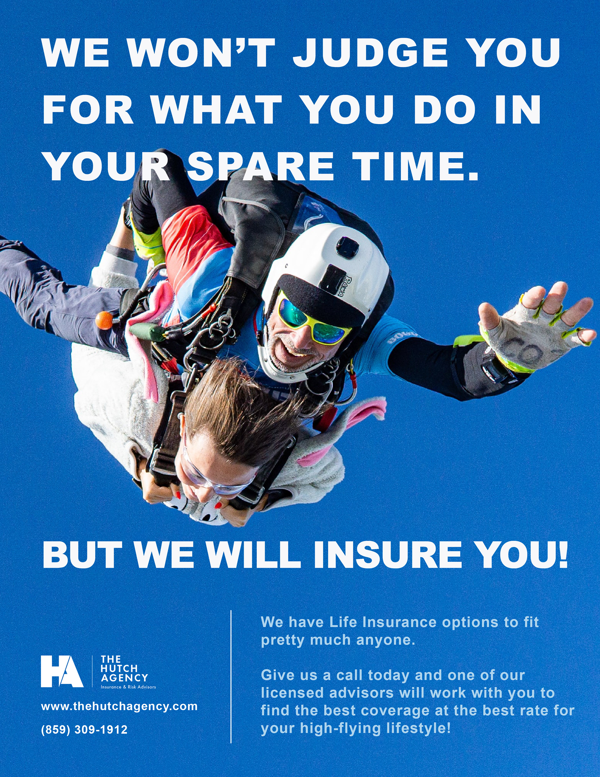
Life Insurance Ad - 1
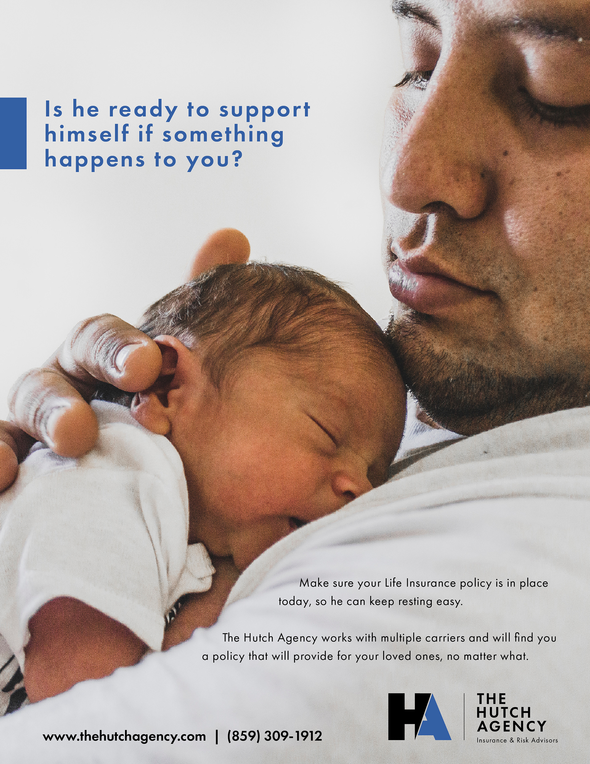
Life Insurance Ad - 2
Client: Boyd Thornton Dental
Industry/Context: Small, local, family-owned dental practice that's been in business for ten years.
Scope: "Did You Know?" infographic poster; matching dental fact cards
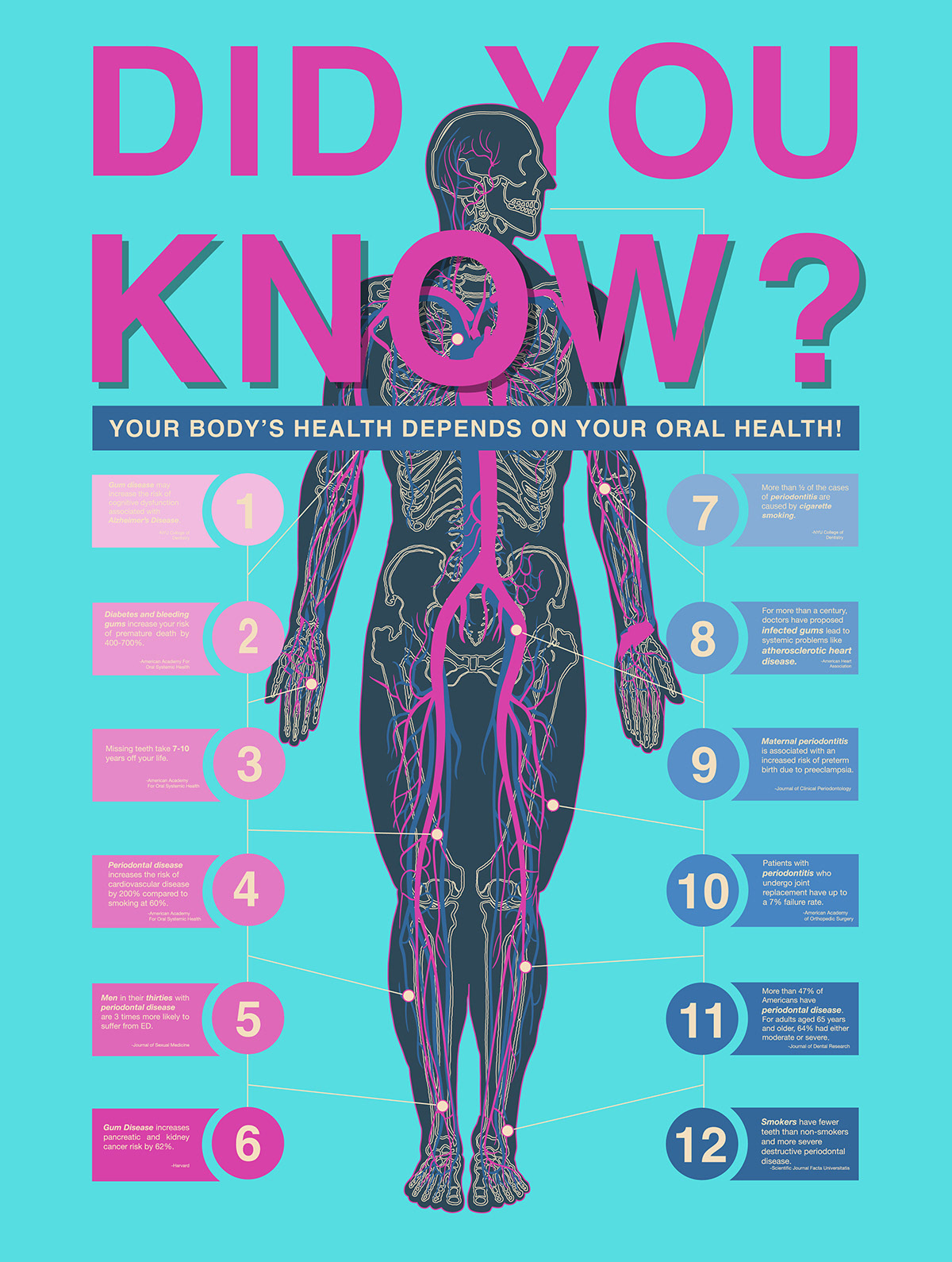
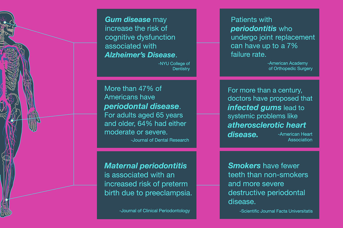
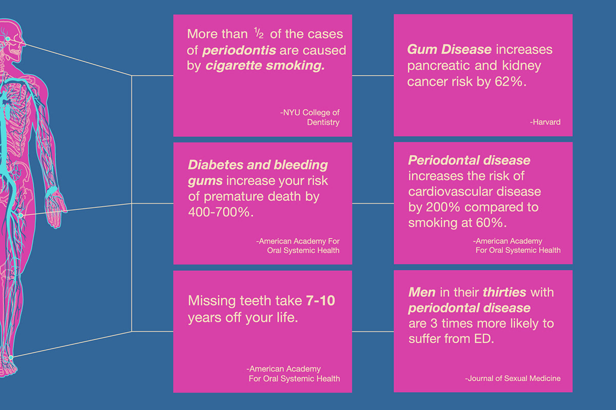
Process: The client, a local dentist's office, felt like they needed a more consistent, relevant strategy to educate and encourage their patients toward better oral health. Many patients viewed their mental health, physical fitness, and dieting or weight loss as unrelated to their oral health, and in turn, tended to devalue preventative maintenance and holistic care of their teeth and gums.
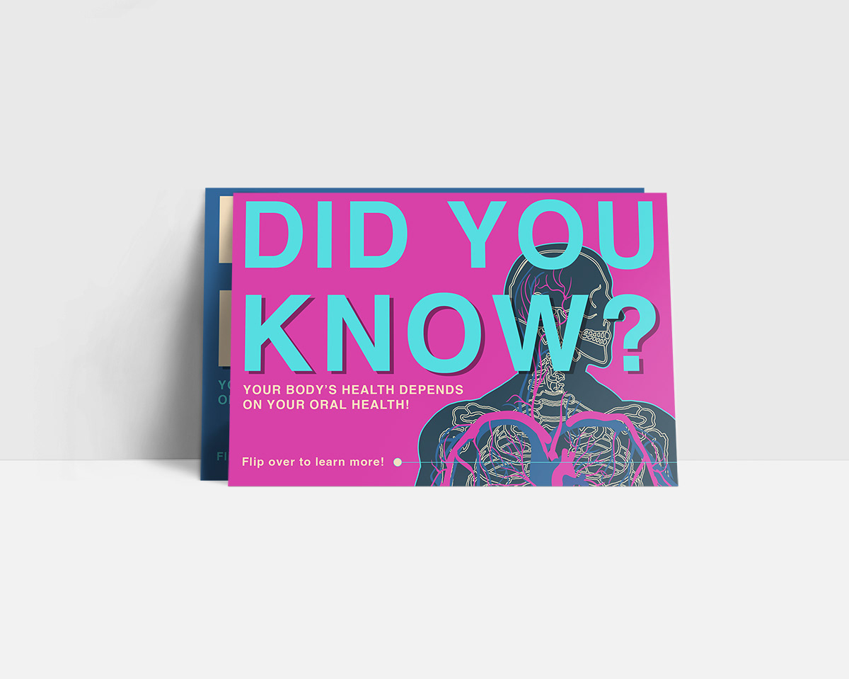
We decided that visually highlighting the direct links between a person's oral health and their overall bodily health via a large, noticeable poster or banner would be the best way to engage with patients on the subject. Their office had a high-traffic hallway off the waiting room where a large poster would be seen by patients in the waiting room and by those walking to and from appointments.
In addition to the poster, we decided to create several take-home postcards that could be handed out with a patient's paperwork upon leaving an appointment. The postcards included the same series of factoids as the poster regarding the close relationships between a person's bodily systems and their oral health.
Their office had a typically modern style with a monochrome color palette and pops of color here and there. To contrast that, they wanted their poster to have highly-visible bold colors, and large, easily readable text. Seeing as patients may only have a few seconds to read the copy while walking by the poster, we knew that the more meaningful engagement with the content would likely be through the postcards. The poster would serve as a primer to pique curiosity, and the postcards would drive home the message.
The client sent me a list of oral health facts to incorporate into the design and gave me relatively loose guidelines on the layout and other elements included. In order to keep the message simple and easy to understand quickly, I decided to include a large diagram of the human body which included the Skeletal System, and *most of the Cardiovascular and Nervous Systems. Considering how complex and intricate those two systems can be on a graphic -- especially when layered over each other -- I opted for a more conceptual depiction, being sure to maintain the primary components for easy recognition. Similarly, in connecting the "fact boxes" to the human body, I decided not to line each fact up specifically to the area of the body it was referencing. Being exact would have broken the design up in a slightly more confusing way, which ultimately defeats the purpose of the poster and cards.
The client was overjoyed with the results! Several weeks after delivery of the marketing pieces, she let me know that engagement with her patients around the subjects included on the poster had increased tremendously!
Project Color Guide
Project Fonts


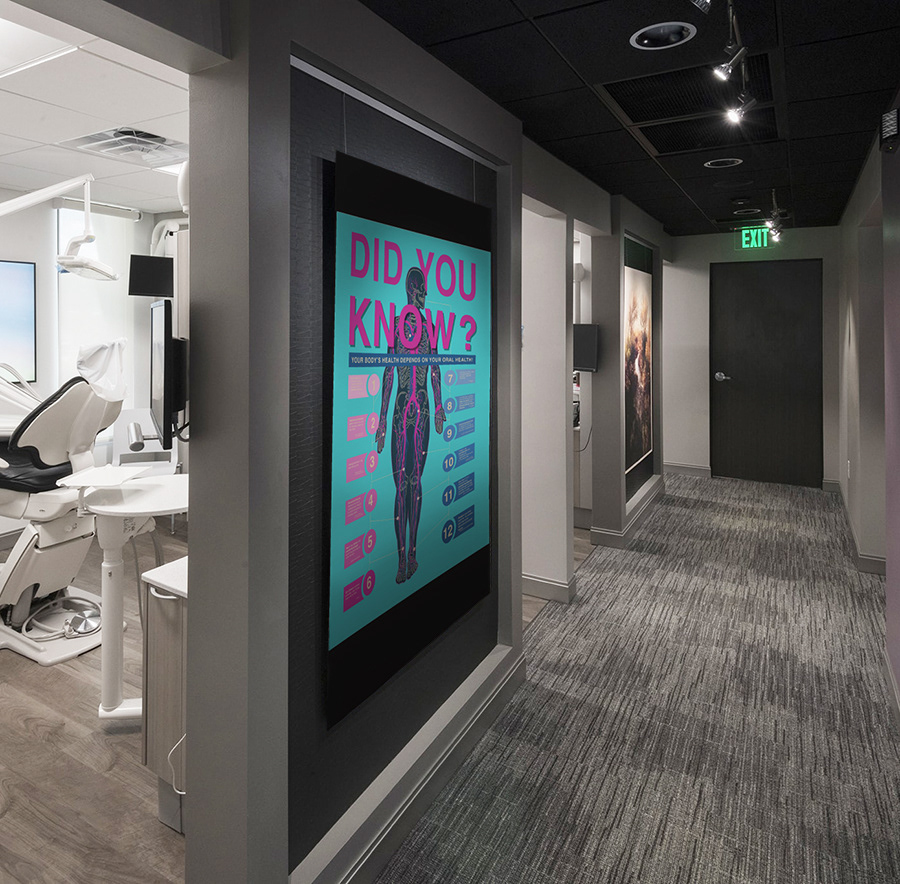
Infographic Poster On-Site
Info Cards
Client: University Christian Fellowship
Industry/Context: College campus-based church in Lexington, KY
Scope: Logo design; business card design; promotional posters; various ongoing marketing pieces
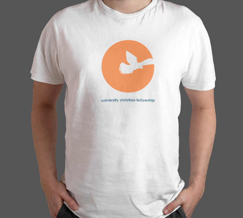
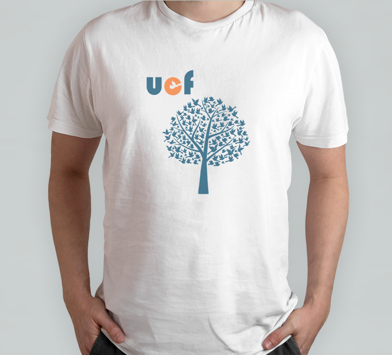
Process: University Christian Fellowship (UCF) is a local campus-based church group primarily made up of students from the University of Kentucky. They did not have a consistent logo or visual identity since previous work was typically volunteered by students within the organization. Over the course of a few years, I worked with UCF on several projects, including an initial logo design, a yearly t-shirt design, business cards for the leadership of the church, and numerous posters, handouts, and flyers for special events and meetings.
Each year in the fall I designed a t-shirt for the church that incorporated different core beliefs into the layout. Some years, we kept it very simple with just the logo, and other times, we opted for more creative designs with deeper meaning. Since there were so many faith-based organizations on campus, we always wanted to differentiate the t-shirts from others as much as possible. The shirts needed to be aesthetically appealing, but we also wanted them to be a catalyst for conversation. Similarly, with the posters and flyers, we needed to stand out from hundreds of other organizations vying for students' attention. We typically kept the designs light-hearted and humorous, with quickly understood visuals and as little copy as possible. Again, the goal was to generate interest and draw people to the meetings and events in order to learn more about the church.


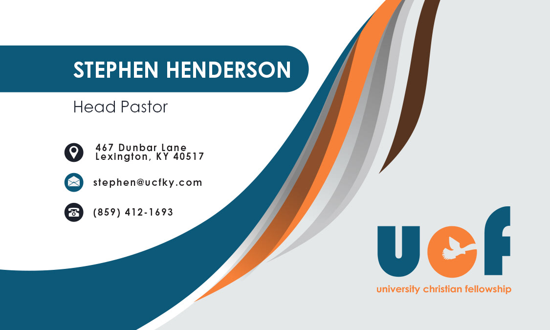
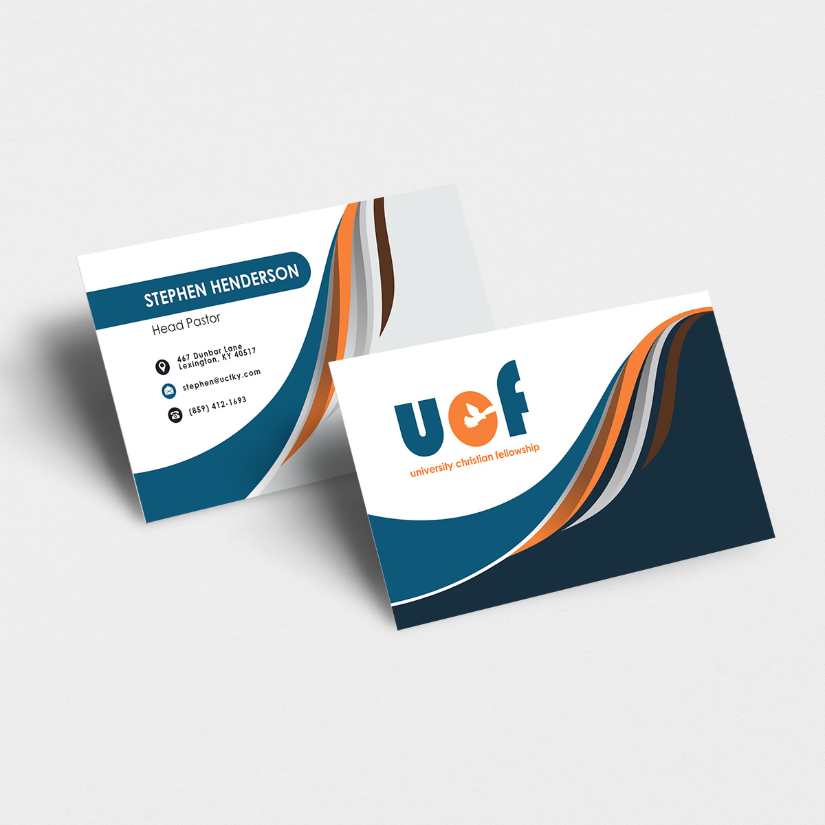
Business Cards
T-Shirt 2018
T-Shirt 2019
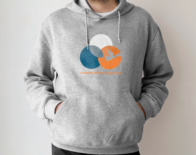
Hoodie 2020
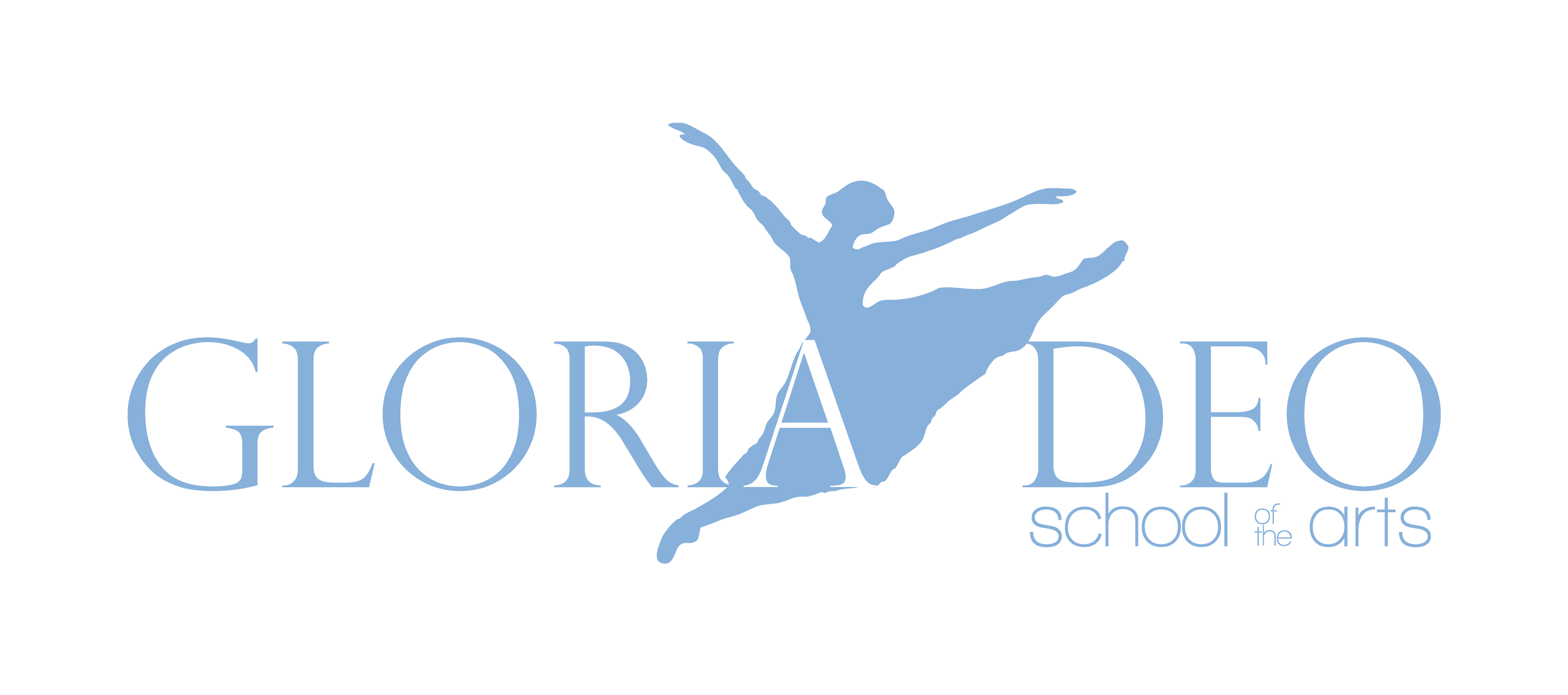
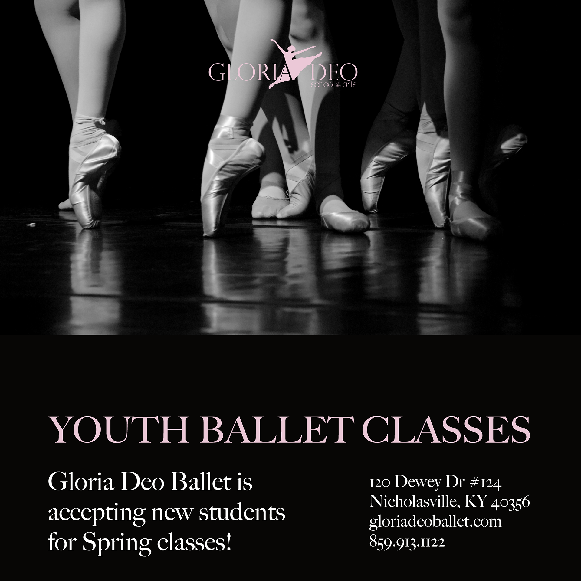
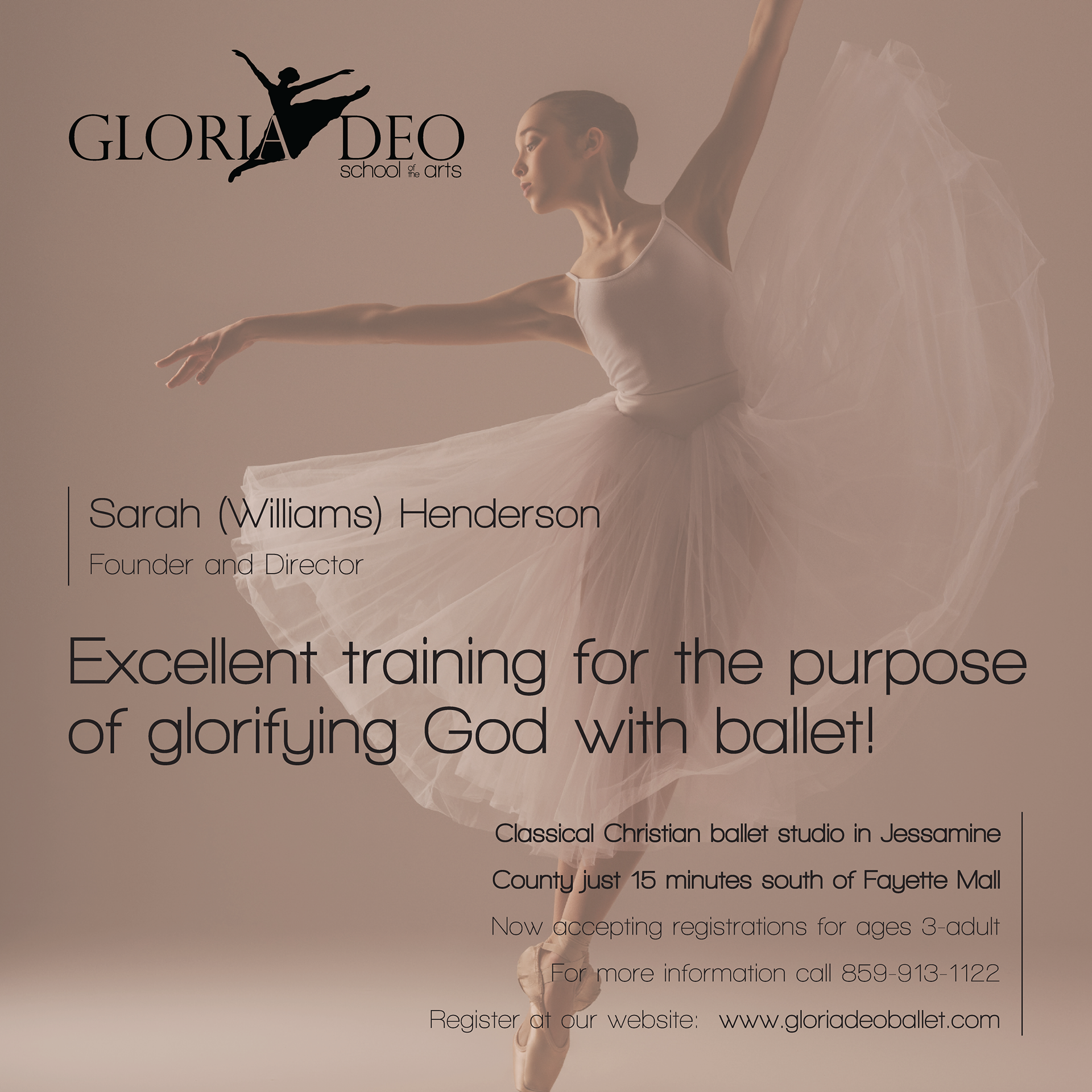
Client: Gloria Deo - School of the Arts
Industry/Context: Youth ballet school located in Lexington, KY
Scope: Brand identity; various ongoing marketing pieces
Process: Gloria Deo is a youth ballet school in Lexington, KY that I worked with for several years on its brand identity, business cards, event posters, student applications and other forms, as well as many other one-off projects and designs.
They were looking for an elegant, simple update to their logo and overall branding, while retaining an innocent softness, considering their target audience was almost exclusively young girls and boys. We went through dozens of options for the ballerina silhouette before landing on our final choice, which was actually one of the school's dancers, pulled from a photo taken at a recital. We felt it had a very soft, airy feel, while also conveying movement and action. The font choice of Big Caslon Medium was used for the primary logotype, and 'School of the Arts' was kept lowercase in Walkway Bold, to give the logo balance and a touch of youthful informality that was a vital component of the school's identity. The owner, Sarah, wanted to make sure that dancers understood the importance of discipline and exactness in their training, but made sure they also had fun while learning. Light blue and light pink are classic ballet colors and were used interchangeably in the logo and other designs, depending on the context.
Once the logo and brand guidelines were finalized, we established a 'feel' for the schools' flyers, applications, advertisements, and other materials going forward. Big Caslon Medium and Walkway Bold were always used for copy, and as much as possible, the designs were kept simple and focused on single dancers or a primary image. Gloria Deo is not a large, expensive school, so we wanted the designs to convey that small-scale, student-focused atmosphere that was so important to its identity.
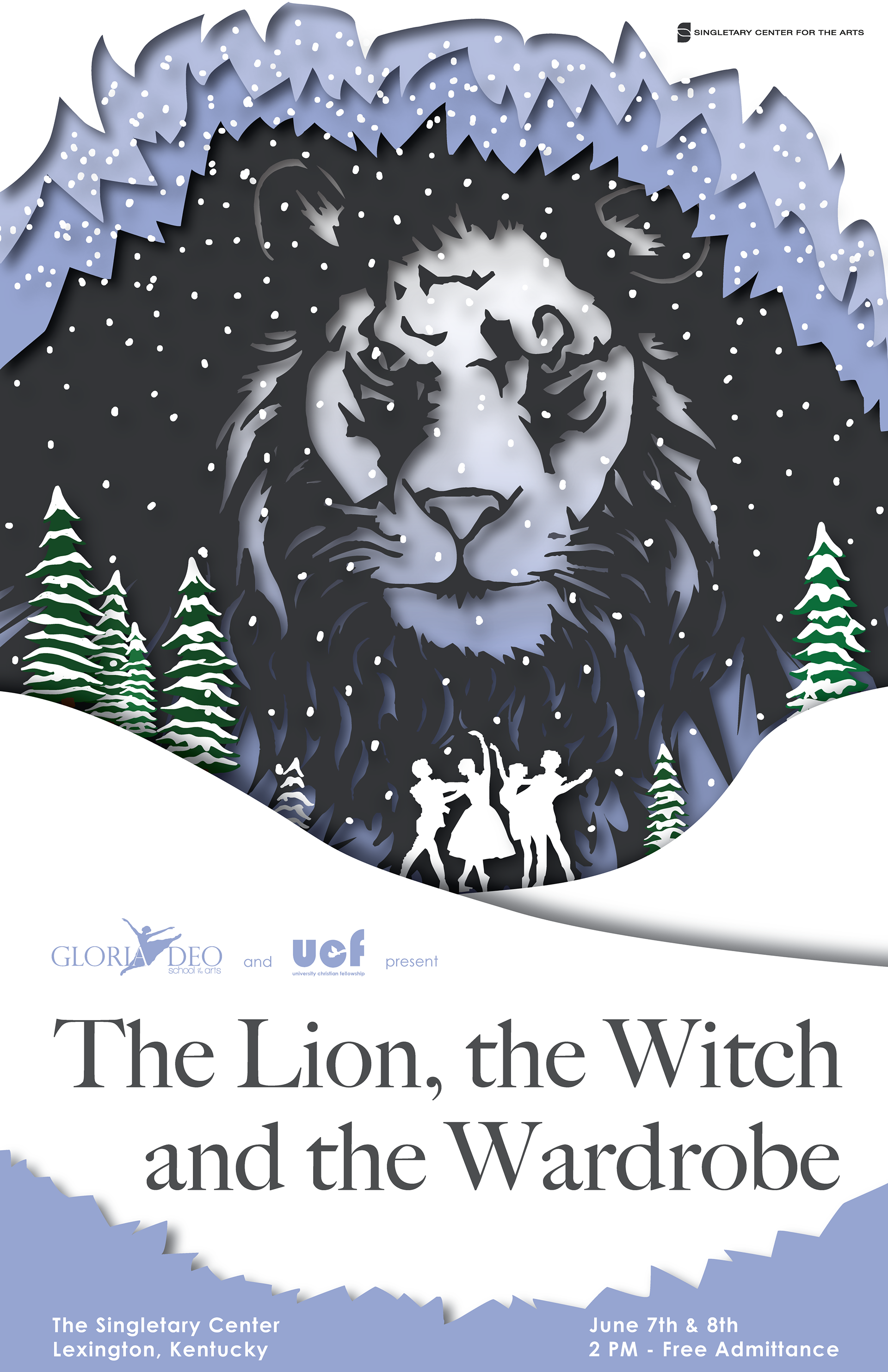
Somewhat in contrast, we wanted the style for the school's annual Christmas ballet posters for The Lion, The Witch and the Wardrobe, to be more exploratory and creative, with bold designs and big themes. Considering that the annual ballet was a free performance attended by hundreds of people who were unaffiliated with the school, the designs could afford to be more grandiose and engaging. Our aim was to attract the attention of as many people as possible to the performance, which was sponsored by a local church and used as an opportunity to engage with the community around faith, family, and the classic struggle of Good vs. Evil. The event also served as a way for Sarah and her students to promote the school to new dancers and their families.


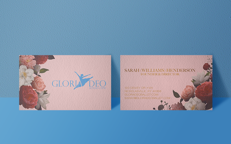
Business Card - Front

Business Card - Back
Business Card
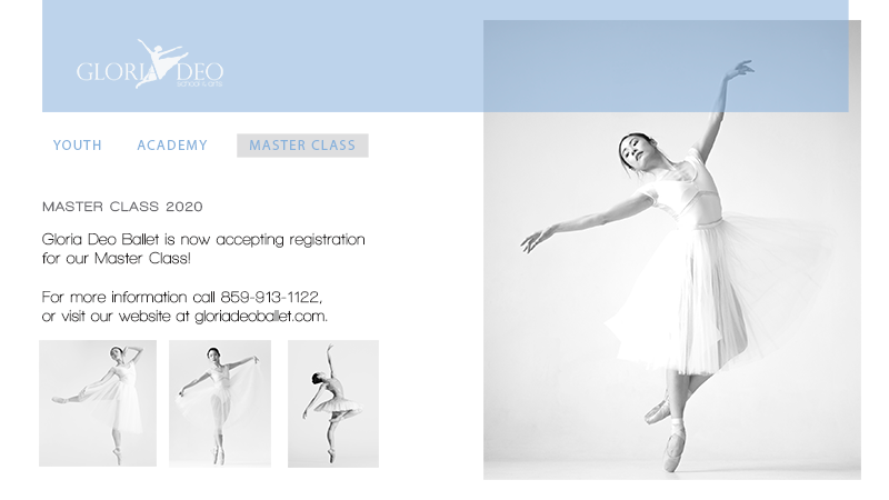
Master Class Promotional Flyer 1
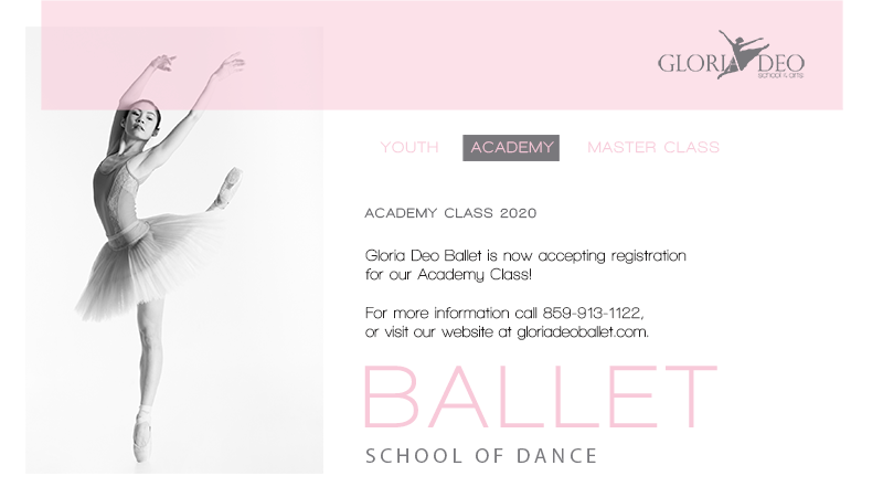
Academy Class Promotional Flyer 1
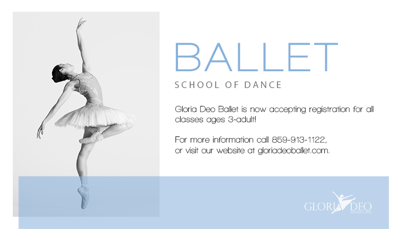
New Registration Promotional Flyer 1
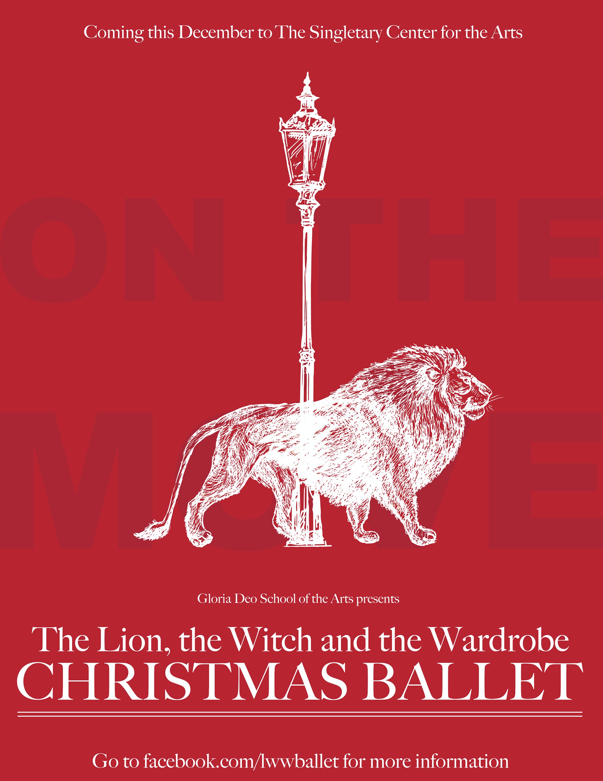
'The Lion, the Witch and the Wardrobe' Promotional Poster 2018
'The Lion, the Witch and the Wardrobe' Promotional Poster 2020
Client: Shenanigans Football Club
Industry/Context: Adult soccer club in Lexington, KY
Scope: Team crest design; Home & Away kit design; Warmup design
Process: SFC is one of the oldest - and there's an argument to be made for the oldest - local, adult soccer clubs in Lexington, KY, having consistently fielded a team in some capacity each season for the past 20 years. They've grown from a single team playing solely in one league to somewhat of a European club model with Men's, Women's, and Co-ed teams playing year-round in various leagues based on skill level and age. Due to their growth and the desire to present a unified look across the broader club, they needed a consistent identity that all the teams could be bonded by. As it stood, each team had created its own "mini-brand" to varying degrees, almost completely unrelated to the original team and club origins.
The team's original "logo" at inception was just a playful variation of the logo of their team sponsor, a Lexington-based Irish eatery of the same name that had become the post-game hangout for the team, and for several years funded the purchasing of the team's kits and league fees. Eventually dissociating from the restaurant as an official sponsor (though retained as a beloved haunt to complain into a beer after a hard loss), the Shenanigans Football Club name lived on, and with it, the distinctly Irish look and feel. Still, SFC never officially created its own unique logo, and as previously mentioned, over the years as teams were added and new personalities came and went, teams either came up with their own look, or in some cases, abandoned all tradition and simply required players to wear whatever green shirt they owned to Away games, and white to Home fixtures. The only somewhat consistent elements across all the teams are the four-leaf clover and the color green (although in many, many hues).
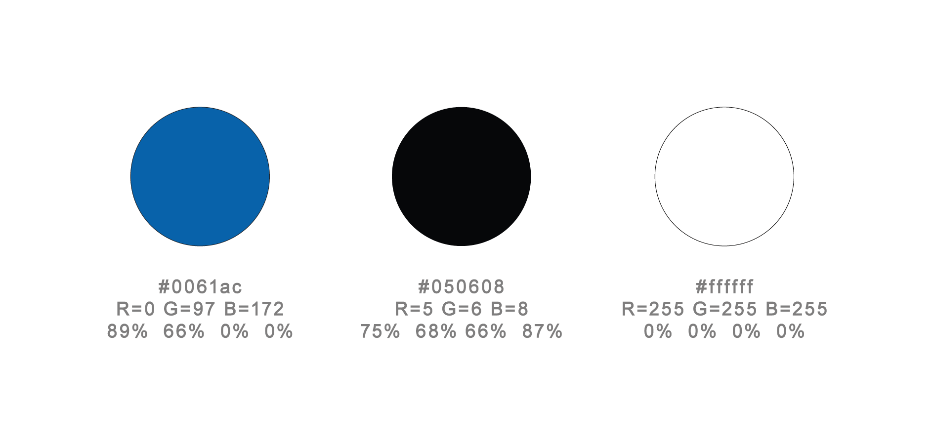
We began the design process by establishing a few absolutely essential design elements or themes that needed to be associated with the brand. The four-leaf clover, the colors Cadmium Green and Navy Blue, and the location (Lexington, KY) were chosen.
Kentucky, also called The Bluegrass State, has had a longstanding relationship with all things blue. Settlers first trekked across what is now Central KY, and, looking out over the rolling acres of budding seed heads reflecting in the late spring sunlight, commented that the grass took on a blue/green hue. Since then, the state has wholly embraced the color blue (with the exception of the city of Louisville, where they defiantly embrace the color red, like weirdos). Blue is widely used as the dominant color in corporate identities for homegrown businesses and companies, as well as many educational institutions. Strictly from a color psychology angle, the color blue has always been associated with feelings of stability, trust, and loyalty, but in Kentucky, blue as a marketing tool is amped up to eleven.
Once we'd established those base elements, creating the logo was a matter of wrapping several other graphical elements into a clean, modern, easily recognizable club crest. We decided to include two blue and two green stripes to represent blades of bluegrass. The outer shield is a centuries-old soccer club standard, widely used in team crests across the world. Dating as far back as the 13th century, European noblemen would distinguish themselves and their family's history by developing an elaborate, deeply personal, 'coat of arms'. Over time, customized shields became a common means of identification for companies, towns, churches, and various types of organizations and companies. As soccer - or "association football" as it was traditionally called in Europe - developed formally in England in the 1800's, teams were often comprised of players from the same town. So naturally, they would adopt their town's coat of arms, or crest, as their team "logo", a practice that has continued to this day, though modern-day team shields are significantly simpler than their predecessors.
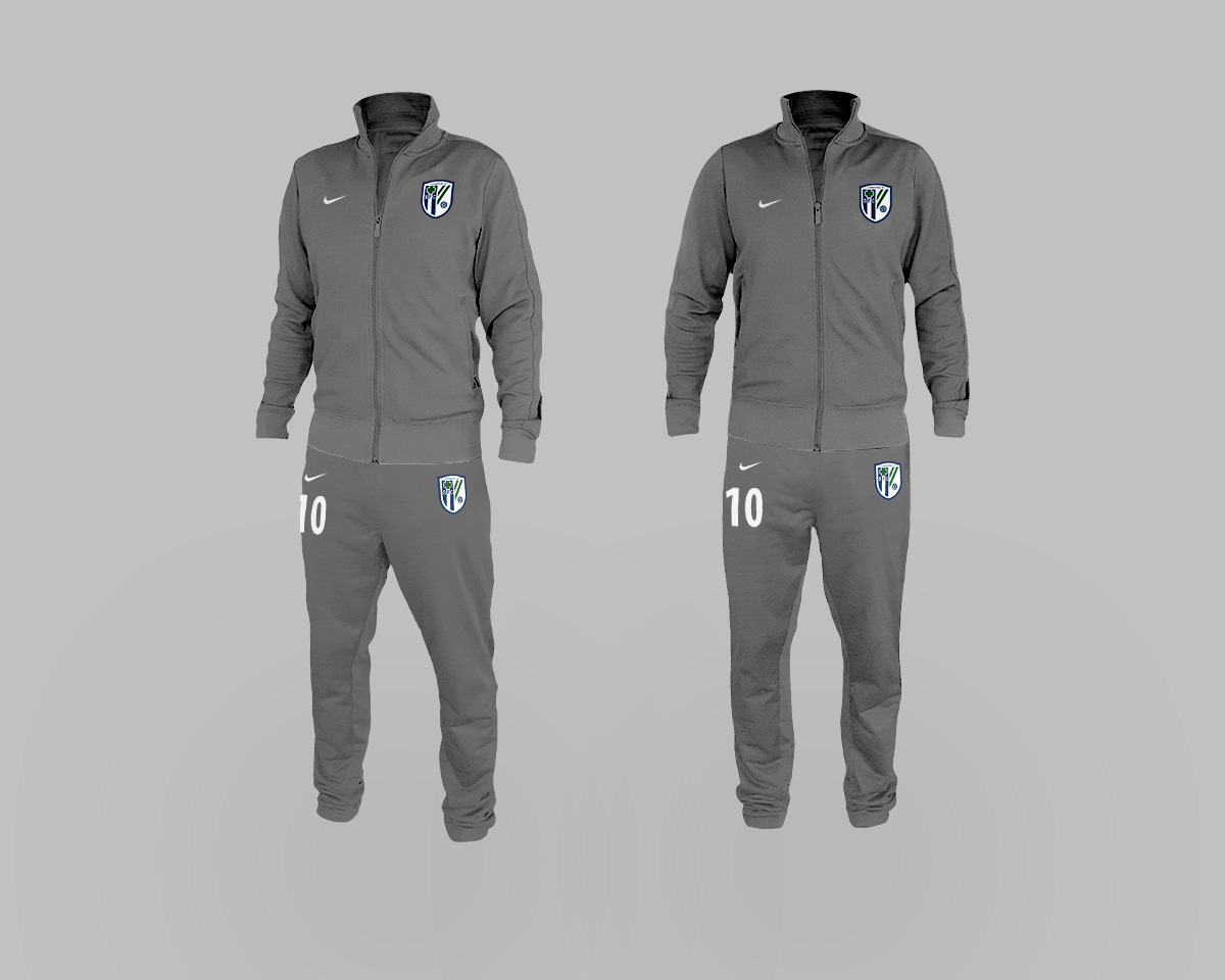
With the crest and essential elements finalized, we moved on to designing the Home and Away kits. Since we'd so thoroughly worked out the personality of the brand during the logo design process, developing the kits was relatively quick, painless, and natural. Simplicity was paramount. The predominant discussion was around the size and color of the four-leaf clover on the right thigh of the shorts. Ultimately, we opted for a smaller, more delicate outline of the four-leaf clover in order to allow the player number and Nike logo to be the dominant visual features. The kit top design was kept clean of distraction and superfluous colors or shapes as well, with attention paid to the hierarchy of the elements. My primary aim as the designer - as delineated by the club's manager - was to "...come up with something that I wouldn't feel like a douchebag if I wore it away from the field." Since many sports team jerseys use corny, over-cooked graphics or excessive lines and shapes as space fillers, I opted for only the essentials. The team warmup co-opted the kit design loosely, with the exception of the full crest on the left pant leg as well, since the top and bottom might not be worn together.
The client (and the players) were ecstatic with the final results of the crest, kit, and warmup.


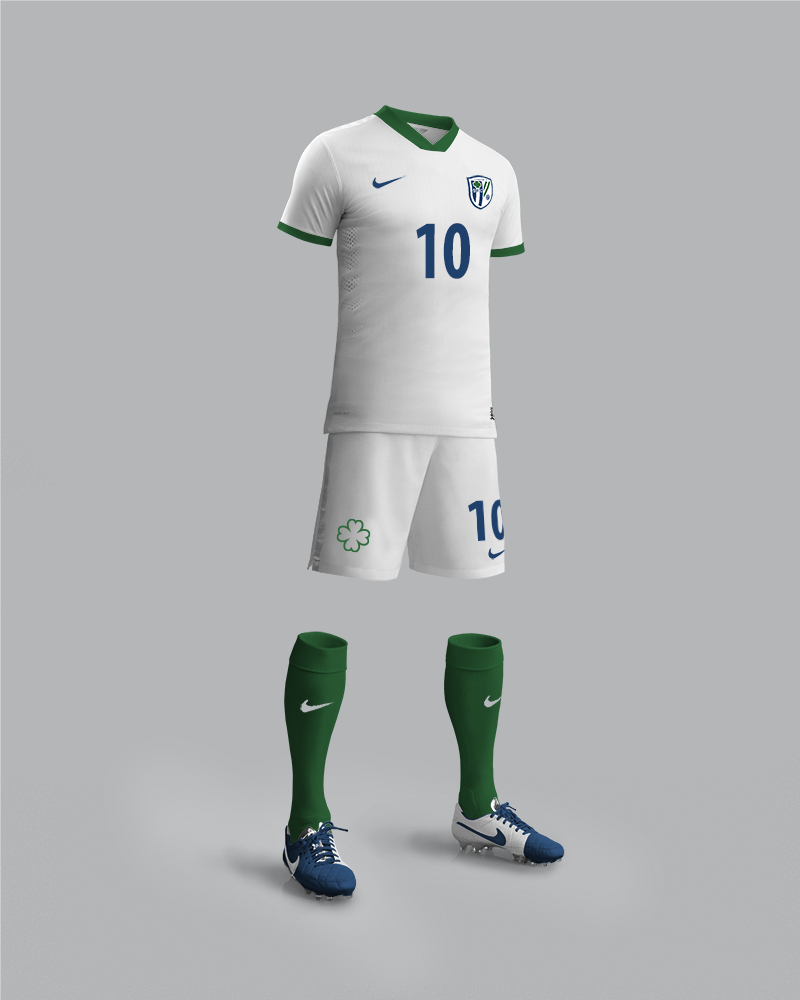
SFC - Home Kit
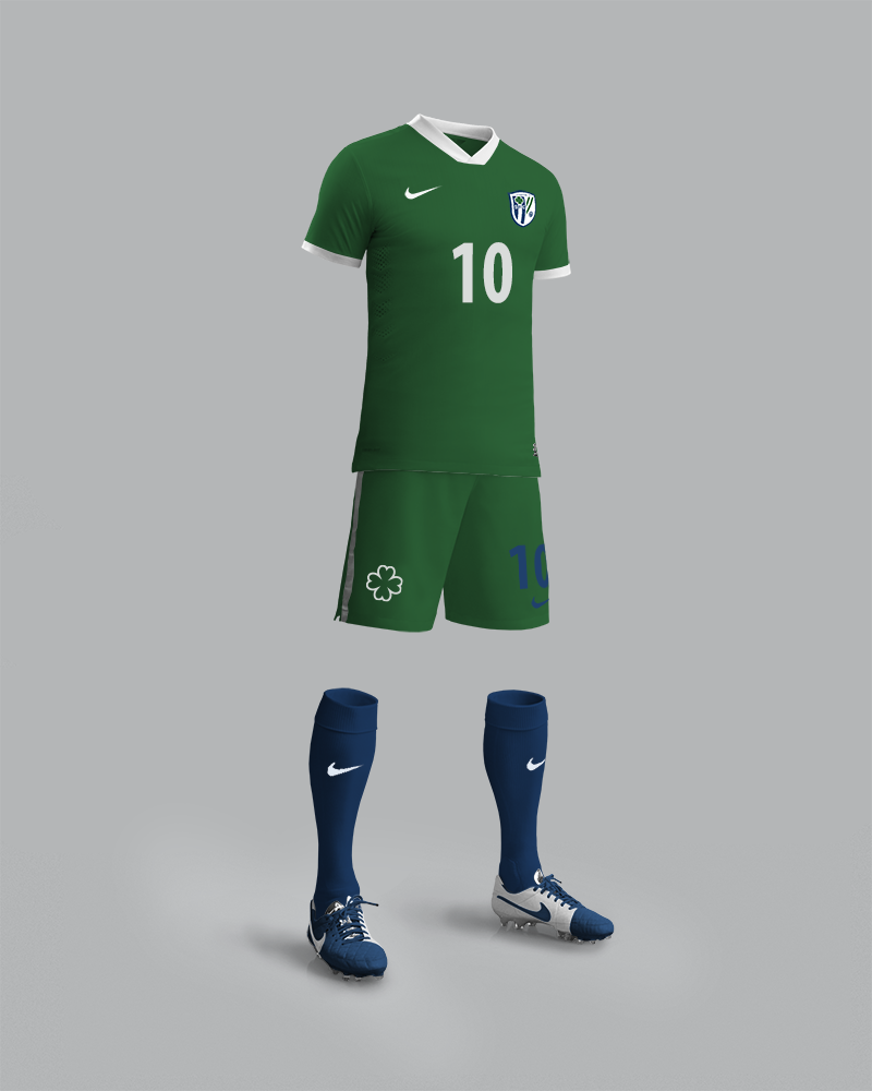
SFC - Away Kit